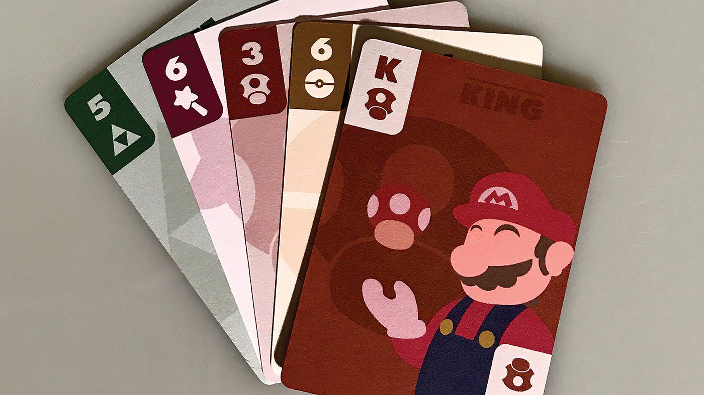
The project objective was to create postcards for a farewell party of a professor at Sacramento State.
There were a few parameters. One of the front design must use just the text all at the same point size but can use different weights, one must have the names of the students, and one must incorporate text with an image. Each postcard design should use different types of paper in its physical form.
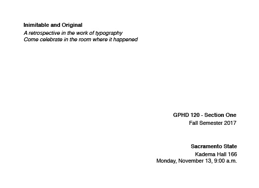

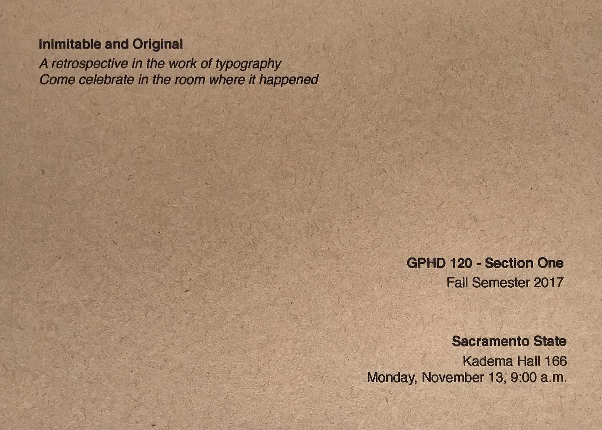
For the first front design, I had left a lot of open space so whatever paper I used, the paper's elements would be very visible.
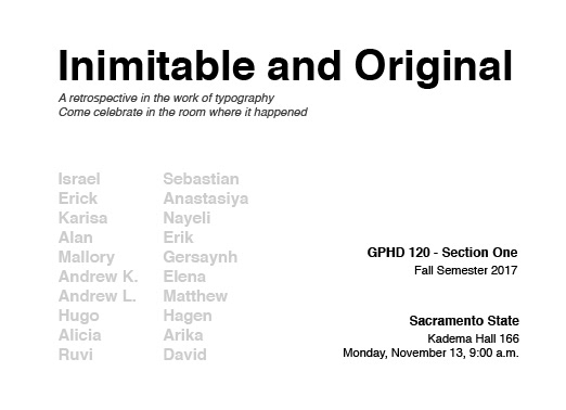
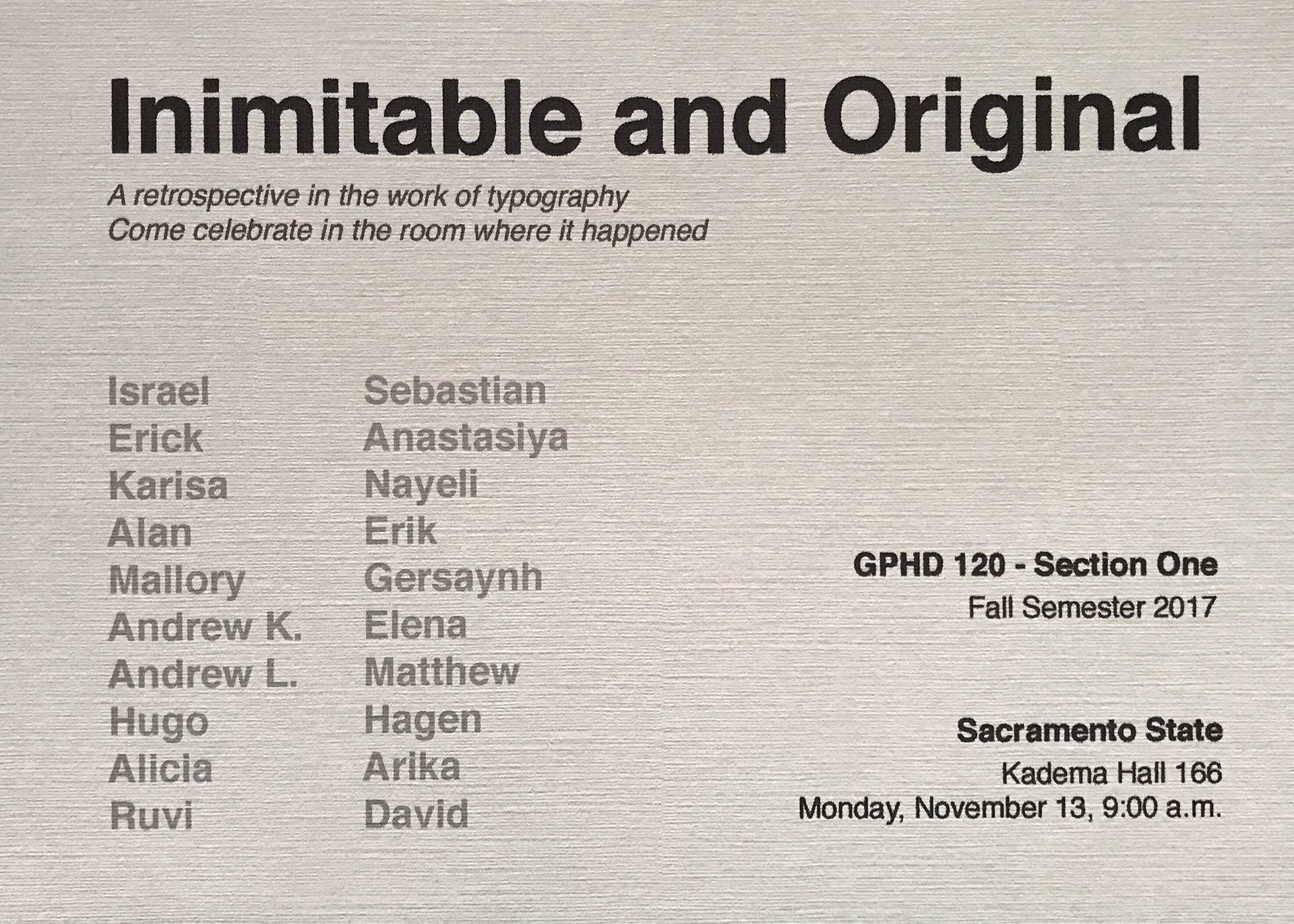
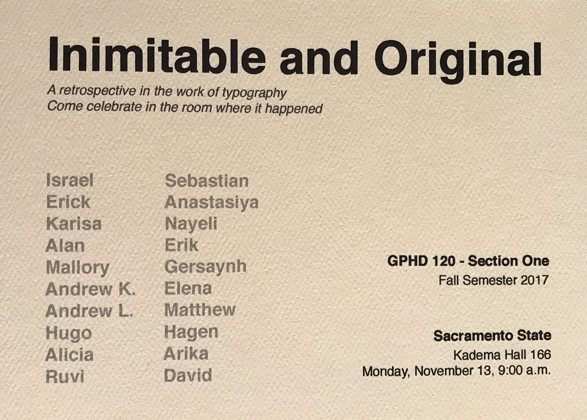
For the second front design, I had used an opacity on the names so that whatever paper I used, the paper's elements would be visible through the names
For the second front design, I had used an opacity on the names so that whatever paper I used, the paper's elements would be visible through the names
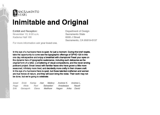
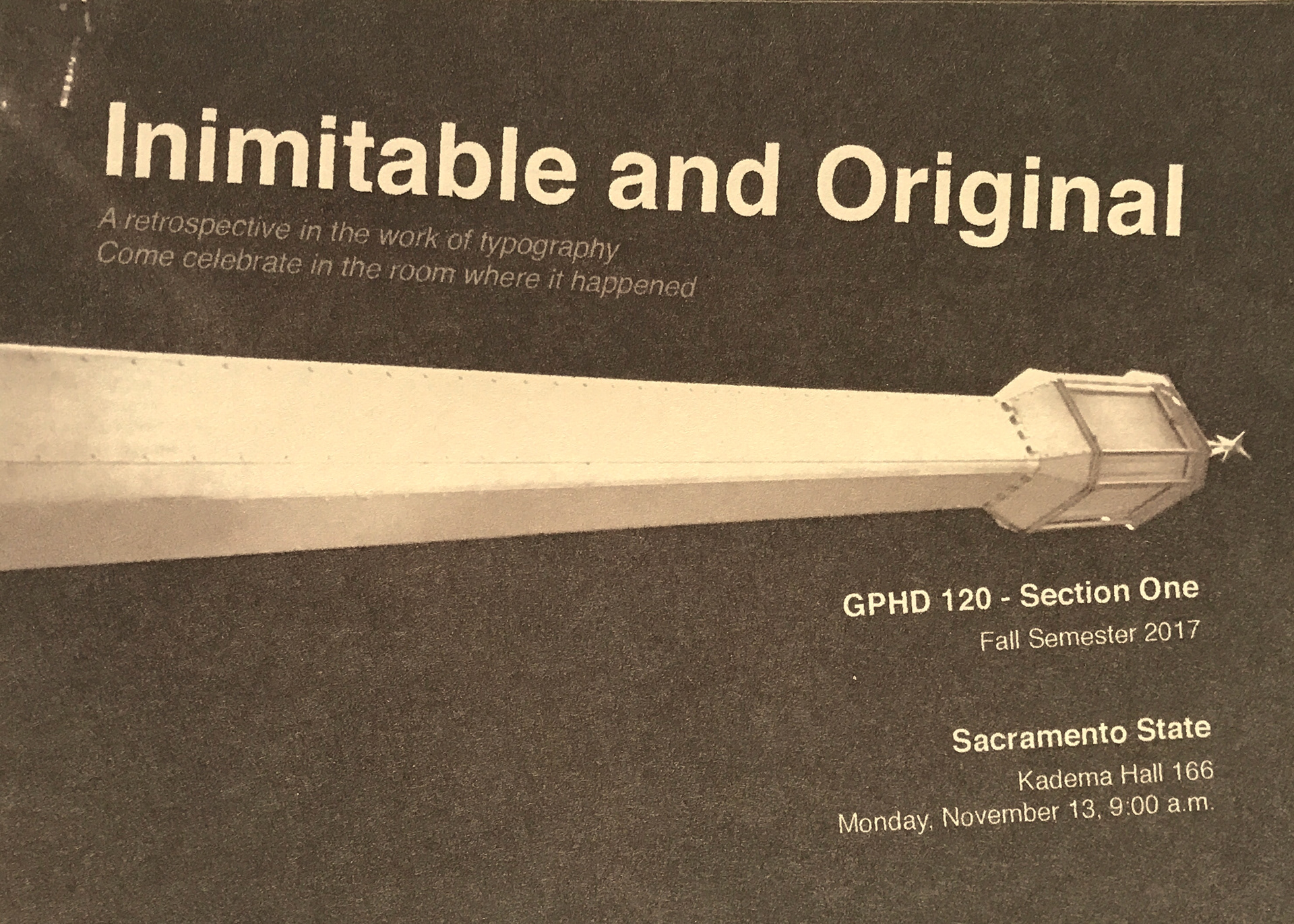
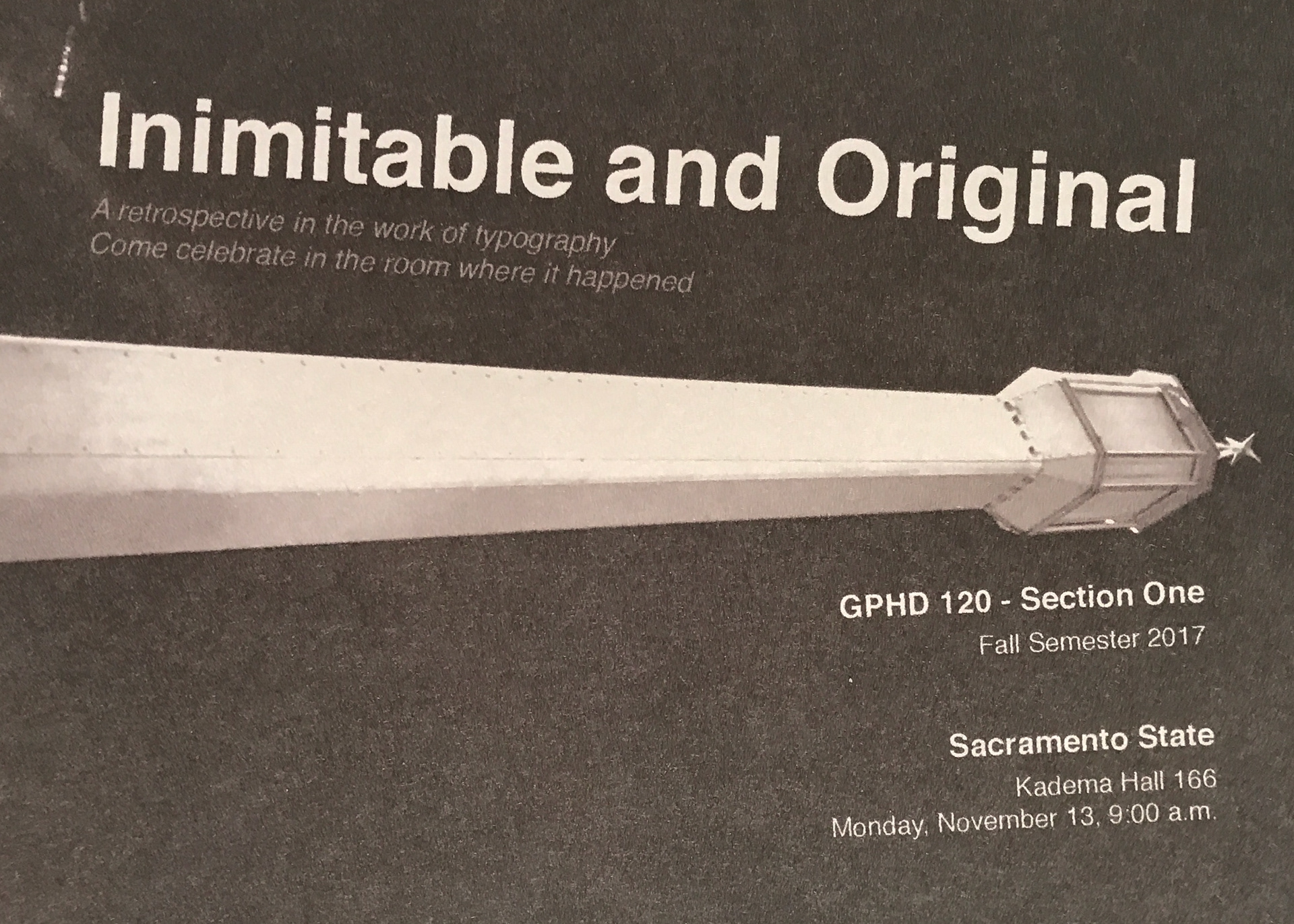
For the third front design, I had taken a picture of a light post at night. This is to symbolize the knowledge being shines onto the students by the professor. I have also incorporated the text to the angles of the light post.
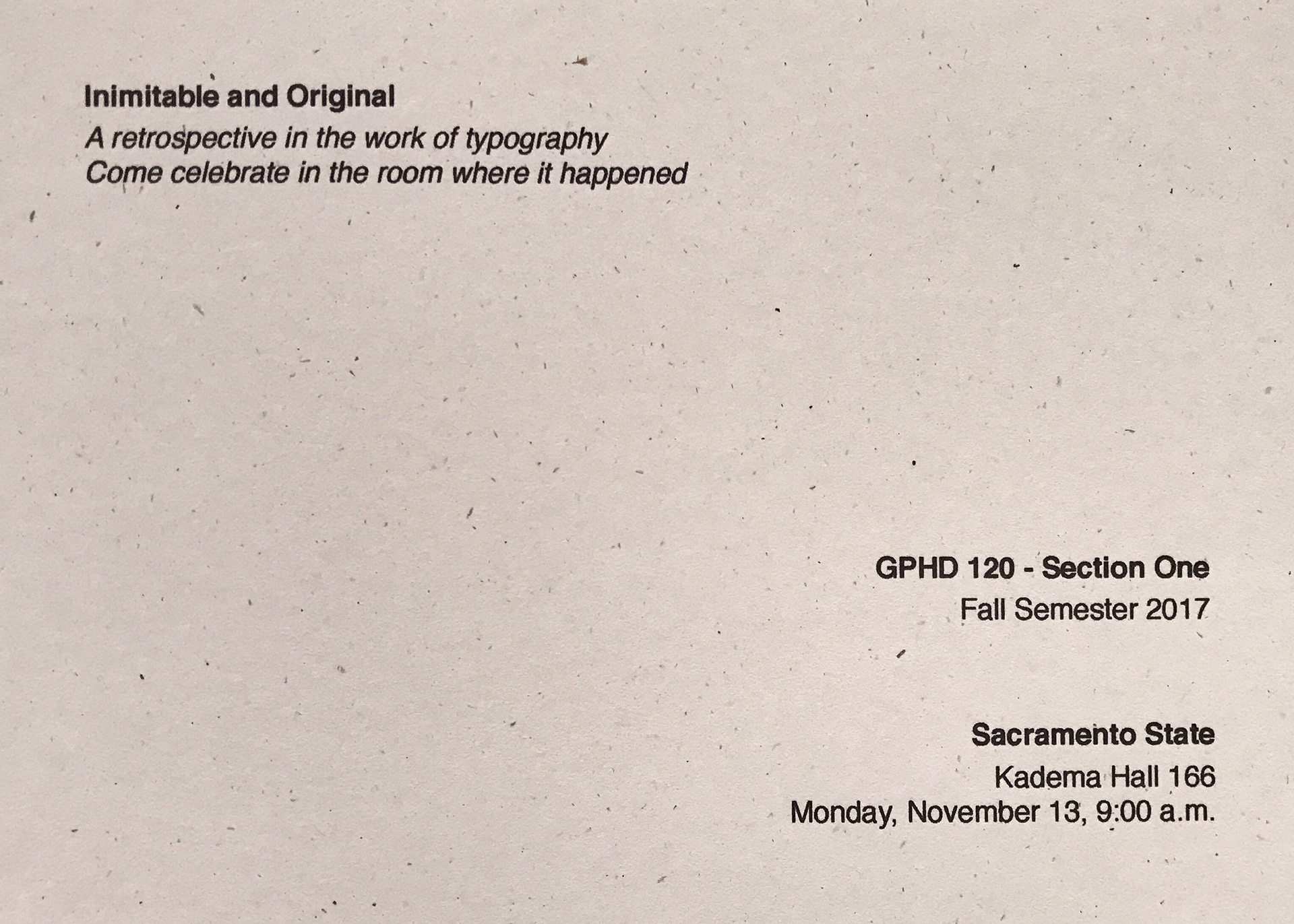
For the back design of the postcard, I had used all design elements from the three front designs.






For the first parameter mentioned, I chose to use paper with various specks and fiber-like grains because these parameters make the design very clean and some elements from the paper would create some interest in the design.
For the second parameter mentioned, I chose to use paper with textures. For the names, I placed an opacity onto them so the texture would be a little more visible through the names.
For the second parameter mentioned, I chose to use paper with textures. For the names, I placed an opacity onto them so the texture would be a little more visible through the names.
For the third parameter mentioned, I chose to use smooth paper. This is so the properties of the paper won't disrupt the quality of the image.
Here are the designs applied to the paper.


