The objective was to design five posters promoting five different concert events. The parameters of this project were one of the posters had to mimic the style of a famous designer and two of the posters had to be in black and white.
This poster was to promote Wynton Marsalis performing at the Mondavi Center for the Performing Arts in Davis, CA. The design decisions were chosen to mimic jazz in a visual form. When you think jazz, you could imagine a jazz club at night; this inspired the black background. Since jazz is a very sporadic type of music, music lines were placed at irregular angles and sizes.

This poster was to promote Robbie Fulks performing at Harlow's in Sacramento, CA. The design decisions were chosen to mimic a western look to tie back into country music. The wood texture can be a reference to a wooden fence on the countryside. The guitar contains elements to mimic an acoustic guitar (which is the type of guitar that Robbie Fulks uses.)

This poster was to promote João Gilberto performing at the CLARA Auditorium in Sacramento, CA. The design decisions were chosen to mimic Ipanema Beach (to relate to his Portuguese version of 'The Boy from Ipanema" as "The Girl from Ipanema.") The pattern shown is also a pattern that is done on the sidewalk of that beach. The same shape of the pattern is done on the right side of the poster to mimic a wave flowing onto the shore. The light colors are to imitate the calm and soothing nature of bossa nova music.

This poster was to promote Weezer and Pixies performing at the Golden 1 Center in Sacramento, CA. The design decisions were chosen to mimic the most recent album of the two bands at the time designing this poster. The top pattern mimics Weezer's 'Green Album' through the color and Weezer's logo through the "w" in their logo. The bottom pattern mimics Pixies's 'Indie Cindy' album through the color and Pixies's logo through the "x" in their logo.

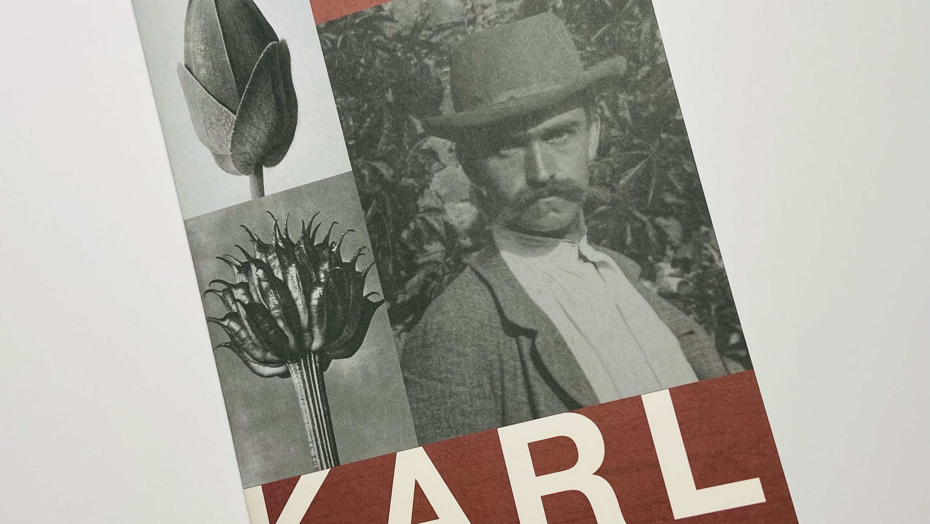
This poster was to promote Lykke Li performing at the Memorial Auditorium in Sacramento, CA. The design decisions were chosen to mimic the style of David Carson. The aesthetics of this poster were designer to imitate the aesthetics of David Carson's posters done for a tsunami benefit at Bowens Island. The text breaking the system of normally placed type was also done to mimic David Carson's style. In order to tie the design back into Lykke Li, a photo of her singing was chosen as the base of the design and then converted into a six color image.

You may also like

Back to Top